Tuesday, December 11, 2012

Gustav Klimt

We were shown this image at the beginning of the semester.

I don't know if any of you remember seeing it but I have not been able to forget. I had never seen this painting before or heard of Gustav Klimt before.


Out of curiosity and really enjoying this piece of art I looked further into Gustav. I have discovered how much I love his work! I have started pricing out prints because I want one of the three pictures I have shown.


Being more and more interested in Gustav Klimt, I started reading up on him a little bit more.
His history is long but here's a few points about Gustav Klimt


-born in Austria-Hungary, was one of seven children and lived in poverty for most of his childhood.


-In 1876, Klimt was awarded a scholarship to the Vienna School of Arts and Crafts, where he studied until 1883 to be an architectural painter.


-In 1894, he was commissioned to create three paintings to decorate the ceiling of the Great Hall in the University of Vienna. Not completed until the turn of the century, his three paintings, Philosophy, Medicine and Jurisprudence. All of which were criticized for their radical themes and material, which was called "pornographic". As a result, they were not displayed on the ceiling of the Great Hall. This would be the last public commission accepted by the artist. All three paintings were destroyed by retreating SS forces in May 1945.

-1899 −1910 the golden phase and critical success phase, where
many of his painting use a gold leaf or prominent gold.


-Klimt died in Vienna on February 6, 1918,having suffered a stroke and pneumonia due to the influenza epidemic. Many of his painting were left unfinished.


It's like the plague!

A few weeks ago now I was feverishly editing my portfolio for COM308W…another class where I burry my head into a computer screen, only it's not design, its all writing. 

I was typing away in the library, working on my portfolio, I found myself just staring at my word document. I was so troubled by the terribly ugly, awful, hideous kerning. Not only was I not using a Mac, as if that alone wasn't bad enough,  this PC didn't even have helvetica! Helvetica is now my typeface of choice and new obsession. #helveticadomination 

Again as I said in my last post, I've become so much more aware of designs, messages of the design, effectiveness, typefaces, all of it! Design snob in the making… its like the plague.

If I look at this any longer..Ill put my head through the screen

This semester, this course, I've spent so much time staring into a screen. There comes a point I'm so close to putting my head straight through the computer screen, that I just have to walk away. I'm sure by this point, end of the semester, we have all experienced this.
Just finished up my brochure, the critique is in about two hours and I am so thankful to have to done. On to the next…. more work to be done. By the end of CEP week I will run myself into the ground, that sure of it. 
My brochure focused on Parkside Community Association's (PCA) Welcome Program. PCA is the same organization I used for my COM 308W portfolio, so I had a lot of background and information from this organization already. Having spent so much time dealing with this same organization, you would think would be helpful. However, at times I found myself at a creative block with stale information I have seen and dealt with for months. 
By the end of this course I am starting to really find my inner graphic designer, I'm finding my own style. I found myself referring back to the Type on a Grid exercise for one section of my brochure when I was lost on how to organize the page. That was exceedingly helpful. All the things we have been exposed to from the movies, to the exercises, to links post on blog have really stuck with me. I am now a conscious viewer of the designs, posters, advertisements, etc. around me. Although we are not design majors, I think this course was very beneficial. It, at times, was tedious but the nonverbal messages in the world are just as important than the things we as communication majors say or write. 

Thursday, October 25, 2012

Happy Belated Birthday Peter Max!

Peter Max just turned 75 last week, October 19. Soo I'm slightly late… typical for me.
If you are unfamiliar he is an illustrator and graphic artist. His typical style is vibrant, bold color along with smooth fluid shapes.
His works touched so many phases of American culture. I admire his ability to inspire so many different generations.

He is very well known for his "Liberty Head"   —>

He was always so well synced with the times, he tapped in the 60's and designed the clocks below for General Electric. These clocks are another piece he is well known for doing.

Our first initials project we looked at design and
discussed what certain design choices could be implying.
Peter Max designs imply livelihood, energy and excitement.
Happy Birthday to an amazing artist.


Tuesday, October 23, 2012

Dia De Los Muertos

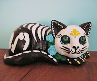
Day of the Dead is coming up! This two day celebration will be November 1 and 2. I am oddly much more excited by this than Halloween. I have always been very interested by spanish speaking cultures. I love the language and I love the traditions. This day focuses on the gathering of family and friends to pray and remember those who have deceased. Aside from the traditions themselves, the art really draws me to this holiday. 

This is a sugar skull and I think they are extremely pretty.
There is such detail and intricate design it makes me just want to stare at them.
We've talked in class about your eye moving across a piece of art, I don't even know how my eye moves across this. My eyes move all over with any clear patten, I just want to stare. There is so much to see in the nature of these artworks.

Brief history: It is believed that the gates of heaven open at midnight on October 31, allowing the spirits of the deceased children (angelicas) to reunite with their families for a brief 24 hrs. The second  day of the celebration, the adult spirits come down to enjoy the festivities as well. Traditionally beautiful alter are put together, adorned with lots of food, bottles of soda, hot cocoa and water, candles, marigolds, folk art skeletons, sugar skulls, etc. It can be a very expensive ritualistic holiday, its believed that happy spirits will provide protection, good fortune and wisdom to their families. On the second day people go to the cemetery to clean tombs stones, play cards, listen to music and reminisce about loved ones they have lost. 

The art pieces are steeped in historical background and mysticism, which to me makes them all the more interesting and all the more beautiful. 


Monday, September 10, 2012

Progress

I am not horrible with computers but I would definitely not say I am the most computer savvy. I do feel as though I've learned a lot about InDesign and Illustrator this week, which were foreign programs to me as of two weeks ago. I like that time we have to do assignments in class, it's very helpful to have people around to answer all my questions! Honestly, I went into this class intimidated and not terribly excited because of the class being so computer based. I'm enjoying the class more and more.

Thursday, August 30, 2012

First Day!

Why is it important for Communication majors to study design?

Communication as a study can encompass journalism, public relations and media production... common theme: conveying information. Design is a key component in conveying information and really is a form of communication itself. Communication majors must understand all facets of communication, verbal and nonverbal.


Why does good design matter?

Good design is very important. Design, being a form of communication, must be able the express a thought, idea, feeling etc. By definition design is purposeful, good design will be able to fulfill its intended purpose and will be able to convey thee intended message properly.

Favorite Design:

My favorite design is something I was exposed to very young. I now live in North Buffalo, right around the corner from a house designed by my favorite architect.


The Darwin Martin house, designed by Frank Llyod Wright. I love mission style/Frank Llyod Wright-ish designs.

Falling Water. One of Frank Llyod Wright's most well known works, can you say that's not gorgeous?